
Quick Links
Quick Links
From a young age, we learn the value of thanking people for their efforts. And given that it’s humans who occupy the digital space, doesn’t it make sense to carry over the same value to your website? It seems obvious but often, thank you pages are overlooked and undervalued. Keep reading to learn about the importance of a proper thank you page for your websites and how you can craft one.
What is a Thank You Page?
A thank you page is what visitors and potential customers see when they submit a form or application on your website. The form or application could be for registration, newsletter sign-ups, order completions, or a booking confirmation page. Whatever action a visitor takes, it creates a better impression for your business (among other benefits) if they land on a thank you page immediately afterward.
Why a Thank You Page is Important
Not having a thank you page could cost you a lot more than you can expect. This page marks a pivotal moment in the customer’s journey.
Usually, a reader or visitor doesn’t decide to subscribe or register for a platform unless they are interested in what the website has to offer. And when they buy something from the site, they are not a prospect anymore; they’ve become a paying customer.
Once the customer makes a payment, the thank you page can take the sales process to the next level. Hence, a business should take advantage of this moment and offer something more to the customers.
Indeed, a thank you page can be a first step to nurture your leads. That’s great because nurtured leads account for 47 percent larger purchases in contrast to non-nurtured leads.

The Anatomy of a Perfect Thank You Page
It turns out that adding such pages can dramatically increase the leads. While many businesses miss out on this opportunity, we ask you to focus more on strategizing for a thank you page. There are three essential elements that you need to add to the thank you page. While some pages are made for the new subscribers and some pages are made for the paying customers, every page must have these elements to have a diverse sales funnel to drive more sales.
1. Confirmation Message
A confirmation message states what action the customer has taken. You won’t believe it, but often customers don’t read everything when they are asked to provide their email address. Hence, it will be helpful for them if you let them know exactly what action they took with the help of a confirmation message.
Spell the action out for the customers, or you’ll leave them disoriented. Tell them “Thank you for subscribing” or “Welcome to the website,”. You can also use this space to tell them what they can expect next from you, or guide them towards further action.

2. Specific Instruction on What to Do Next:
After a purchase or sign-up, a customer’s interest level is red hot; it is your responsibility to tell them what to do next. Remember to add specific instructions in the Thank You Page to avoid letting the customer wander off.
The instruction could include, asking to sign up for webinars, linking their social media profile with their account, or heading to the homepage or product page that matches their interest. On purchase, you can provide order details on the thank you page and tell the buyers where they can track the orders online.
3. Clear Call to Action:
A strong and clear call-to-action helps the customers take the next step. CTAs are used to provide instructions with highlights like sending the users back to the homepage or providing them the link to your blog.
According to Michael Aagaard of Unbounce, CTA is the “overturning point between bounce and conversion”.
Ask the leads to fill out information for a survey, give additional discounts and offers, or suggest them related products.
Indeed, “adding the survey on your thank you page is perfect for getting those subscribers involved early in their sales journey with your company”, says Mason Hindle (a content manager at Essayroo).
The thank you page accomplishes three main goals:
- Drive more traffic than usual
- Nurture the specific needs of the leads
- Better customer acquisition
A page that is thoughtfully designed and crafted would appeal to the customers to take further actions that can benefit your website. If you think that a thank you page has no other role than expressing gratitude, you’re missing out.
Examples of Thank You Pages
After careful considerations, we have narrowed down the best examples of implementation of a Thank You Page. Taking inspiration from these thank you page examples, you can scale up the conversion rates.
1. AWeber:
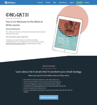
The Thank You page by AWeber is simply beautiful. With an elegant design and clean interface, the designers use an interactive font and color to notify the customers that they have access to the website content, features, products, and services now. The optimistic use of images and bright colors give a warm welcome to all the customers.
And as the customers scroll down, they will come across a CTA included regarding a webinar that users might be interested in. For a personalized feel, AWeber will also show a pop-up window thanking the user for signing up and making suggestions for the services that the user would like to opt for.
2. HubSpot
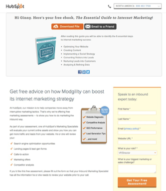
When it comes to HubSpot, they have some of the best thank you pages. Not only do they provide a clear message of the order confirmation, but they also suggest you share the content with others.
One remarkable thing about HubSpot’s thank you page is that it includes free marketing advice. What’s better on the page is that they add a personalized message to make their offer more attractive. They have added their contact number on the page so that customers can reach out to the representatives directly.
Hence, the page can be used as a direct sale generation tool for faster results. HubSpot took their own advice and utilized image messages on the page. The visual content has a larger impression on the user as compared to the text. The guide on the page gives them an insight into the marketing techniques without overloading viewers. This can be a great way to approach the buyers to opt-in for additional services provided by your business.
3. Conversion XL:
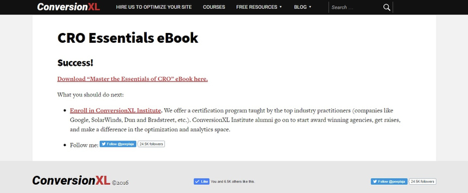
Instead of sending an email to the customers, Conversion XL displays a thank you page like pop-up windows. Instead of confusing the readers with a wide range of options, they give a clear-cut action-oriented objective for the next step.
For every action users take on the website, they will see a message suggestion regarding what they can do next. In this way, they prompt users to browse the site for more information even after they’ve already become a paying customer.
To reach the customers on all social media platforms, they have also added a link to like their Facebook and Twitter pages. And who wouldn’t want to stay updated with their favorite brand and business on social media!!
4. Shopify:
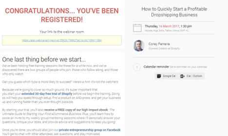
Here is an example of a thank you page that is worth reviewing. As you can see in the image, the website notifies you when you register with Shopify for a webinar. And to direct the customers to the webinar information, they have provided a link right below the message.
On the right side, you see the notification of the upcoming webinar with date and time. The thing that we like the most about the page is that it guides the users to implement their knowledge in the practical world. They notify the visitors that they’ve been hosting such webinars for quite some time now. And their knowledge could be of some use to the readers. This encourages the readers to opt-in for the free trial with Shopify.
Offers like free trail and additional features are something that is appealing to the customers. We already know that Shopify is among the largest eCommerce platforms. And when they’ve put in so much effort in their thank you page, it pays rewards.
5. Leadpages:
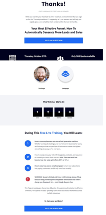
Now that you get the basic essence of the thank you page examples, here is a page for you that you can integrate with your website right away. Leadpages use a simple interface for the thank you page, where they express their gratitude in the most humble way. Moreover, you see an action confirmation button that further asks for assurance on your behalf, making the customer feel engaged.
Leadpages have been using a very effective persuasion technique to attract customers. It involves offering a free spot for the upcoming seminars. However, the free offer is only valid for limited users, which means that your website will get more traffic, and lead generation also increases. Still, we believe that it will be better if they include their social media profiles on the thank you page as well.
The thank you page of CopyHackers is something that makes a great first impression. And it also offers the customers to take advantage of a limited time offer specially customized with a countdown clock. This offer creates a center of attention for the users, and as they opt for the free email templates, this is generating leads for the business.
It is an effortless lead generation and sales conversion tactic that usually works. Just think from the customer’s perspective that the moment you subscribe to a service, they thank you and welcome you by giving additional offers.
So, these are some of the best thank you pages from around the web. It is apparent that a startup business won’t try directly to compete with a Fortune 1000 company. Instead, they’ll focus on the local competitors and optimize the thank you page to bring more leads.

Points to Remember
Now that you know the importance of a simple yet effective thank you page, there are some key points that you should remember. To make our website more striking or appealing, we sometimes overdo things that don’t look good from the customer’s point of view.
So, here are some things that you should keep in mind while creating the thank you page:
A Clear Message
It ensures that the leads know what action they made. Tell them clearly what they’ll be getting and thank them with meaningful words. According to the U.S. Small Business Administration, 68% of customers leave as they feel the business does not care about them.
Include Free Offers
One thing that everyone loves is a free offer. When a person makes a purchase, lure them with books that might be helpful or interesting for them. You can provide links for the books that are available at half price or let them get a free preview of the books. That could be a fascinating way to grab a customer’s attention and overawe them to make the purchase.

Provide Navigation
Don’t let the buyers get stuck on the thank you page. Add a navigation panel to let the visitors browse more content or look for other products or services they would like. Direct them to a page that could be beneficial for them and you simultaneously.
Provide Additional Content
Link the content/product/service to other pages of your website. It is all about providing the customers an insight into what knowledge, product, or service we hold that can be of their use. Warm up the user by providing relevant information that will come in handy for them while buying something. Consequently, it will portray a positive image for your business.
Video convert better. Indeed, incorporating a video on landing pages can boost conversion up to 80% and 64% of readers or visitors are more likely to purchase a product after watching a video.
Include Social Profiles
Place your email address, Facebook profile, Instagram ID, Twitter ID, or YouTube Page link, adding links for your social media profiles is an efficient technique to connect with the potential leads.
Give Opportunities To Share
If you are creating good quality content, then don’t hinder your success yourself. Allow the customers to share your content from the thank you page directly.
Finals Words
Good thank you pages provide educational content. Guiding your leads to a path that is fruitful for them is the best way to retain customers. The more you help your customers and appreciate them for being a part of your business, the more they will love you for it.
