Quick Links
Quick Links
A recent survey revealed that the average eCommerce store converted only a mere 4% of its visitors globally. It is a harrowing statistic that shows how 90% of the website’s conversion potential goes to waste just beneath your nose.
While you may find many marketing blogs that recommend different techniques to boost your conversion rates and achieve higher sales, these practices may work well for some pages but remain completely inert for others. For example, using dedicated landing pages, specialized pitch, or pushing content in selected spots has proven to yield a better conversion rate for many websites. Yet again, it behaves differently for every website and you may not get the same results given the uniqueness of circumstances.
In this article, we take the opportunity of sharing 8 tactics to optimize your client’s landing pages that will prove immensely useful in successfully converting 90% of the market’s untapped potential.
1. Organize Your Content
Product categorization is a highly effective method for landing page optimization and helps organize and supplement content such as small descriptions, education information, images, and videos, etc. Structuring content on the website makes it easy for viewers to navigate products, read the product information and come to a conversion decision. Think of it as a local grocery store that uses various aisle signs to communicate different departments, product locations and help desk information for visitors.
As a result of this organized environment, visitors are able to run searches more efficiently, easily find products and reach a buying decision more quickly. Similarly, adding separate product tabs on the landing page can give a better presentation of the brand’s products and explain their value proposition more effectively to the visitor.
2. Display HD Product Images
Having high-quality images on your eCommerce website is imperative for your landing page optimization strategy since today’s shoppers expect a high standard of quality images. Showing detailed images of the products is the closest alternative you give to customers since none of them can physically pick or examine the product. The higher the quality of the image, the better chance you have to engage the prospect. In the image shared below, designers from FMEextensions, a Magento extension development company used HD images next to product descriptions and effectively increased the site’s conversion rate by 30% in a matter of 2 months.
3. Improve Your Checkout
Cart abandonments are common misfortune among online merchants. But what if we told you cart abandonments could be effectively reduced, better yet, completely avoided with the right course of action? According to a report by Baymard Institute, 67.45% of online shopping carts are abandoned.
Outside of the United States, the conditions are even worse where cart abandonment rates can soar up to 80%. Although every shopper may have a unique story of abandoning their cart, there is always a common problem that they may have faced and therefore decide to leave the checkout page halfway through.
The majority of the time, people abandon carts because they are dissatisfied with the length of the checkout process. Other reasons include the high level of complexity, unexpected costs, and the unnecessary presence of form fields. Therefore, you can add custom fields to your checkout page to optimize the landing page that directly compliments the store’s conversion funnel.
4. Provide Social Proof
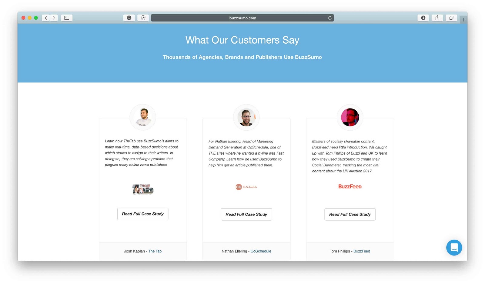
Showing social proof is among the most powerful tactics to optimize landing pages. Sadly, it is the most neglected ones as well. Social proof is the strategic implementation of third-party sources to engender trustworthiness and reliability through your brand and products. Social proof not only helps validate the brand’s product quality but also highlights how the customer felt about it and why it is a better choice among other similar products.
You can use customer quotes on product sections, add social sharing options to bring more exposure to the products, and offer incentives to customer leave reviews to further promote engagement. Case studies, testimonials, reviews, how-to-videos, and trust icons are among the most effective forms of social proof for landing page optimization.
5. Add Notification Alerts for Out-Of-Stock Items
While showing out-of-stock products the store might seem like a tactless move, it is actually quite effective in digital marketing for gaining the customers’ interest and prompting them to return for what you are offering.
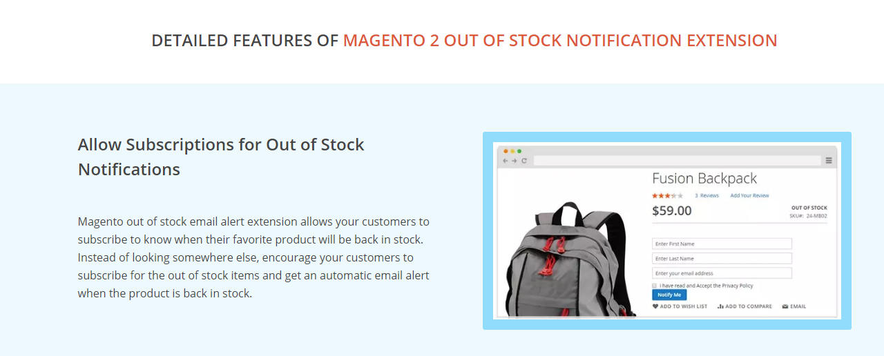
>Additionally, showing items that have been sold off in the stock validates the store as a trusted source for shopping online. This can help stimulate future purchases of your client’s products and serve as an impetus in building a trusting relationship with their customers. Fortunately, you can easily automate out of stock notifications by installing an extension for the store to give all the visitors a reminder notification when the product is back in stock. These plug-ins also allow you to collect customer information that you can use to nurture email campaigns for the products.
6. Write Engaging Web Copy
One of the most common challenges webmasters face while getting results out of their client’s landing pages is the appropriation of marketing content. Since designers enjoy a freehand over their creative instincts and make the landing page as appealing as possible, there is a lot of marketing material that gets added without any actionable outcome.
To top that off, most users tend to leave the landing page within a 15-second window which makes it more complicated for slow-loading animations, graphical elements or the web copy you may have worked so hard for. This brings us to our 6th tip on the day, “Be Clear, Not Clever”.
The content should be solution-oriented, answering to the problem the customer searched all the way to the website. Everything from your catchphrases, headlines, missions’ statement, introductions, descriptions, product features, CTAs, and even testimonials should communicate how to fix the problem, quickly and effectively.
7. Create Urgency
If you have ever come across a third-rate electronic store you may have seen a giant sign reading “Going out of Business”. Fortunately, these signs are merely a conjuration of the business’s status quo (I assure you they do pretty even in the course of bankruptcy as they claim). In reality, these signs serve the purpose of building a sense of urgency between the customers by making offers that are time-sensitive.
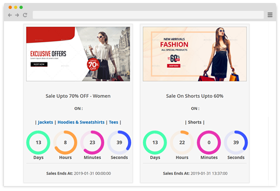
In e-commerce, the element of urgency holds indefinite power. A carefully vetted strategy that uses the element of urgency has the power to change the fortune of a business overnight. You can build the same sense of urgency by running flash sales campaigns. Flash sales allow you to target specific products and put them out for sale for a special period of time. Using attractive graphical elements and countdown timers, you can execute a perfectly timed flash sales campaign on your landing page and boost your conversions.
8. Add Live Chat
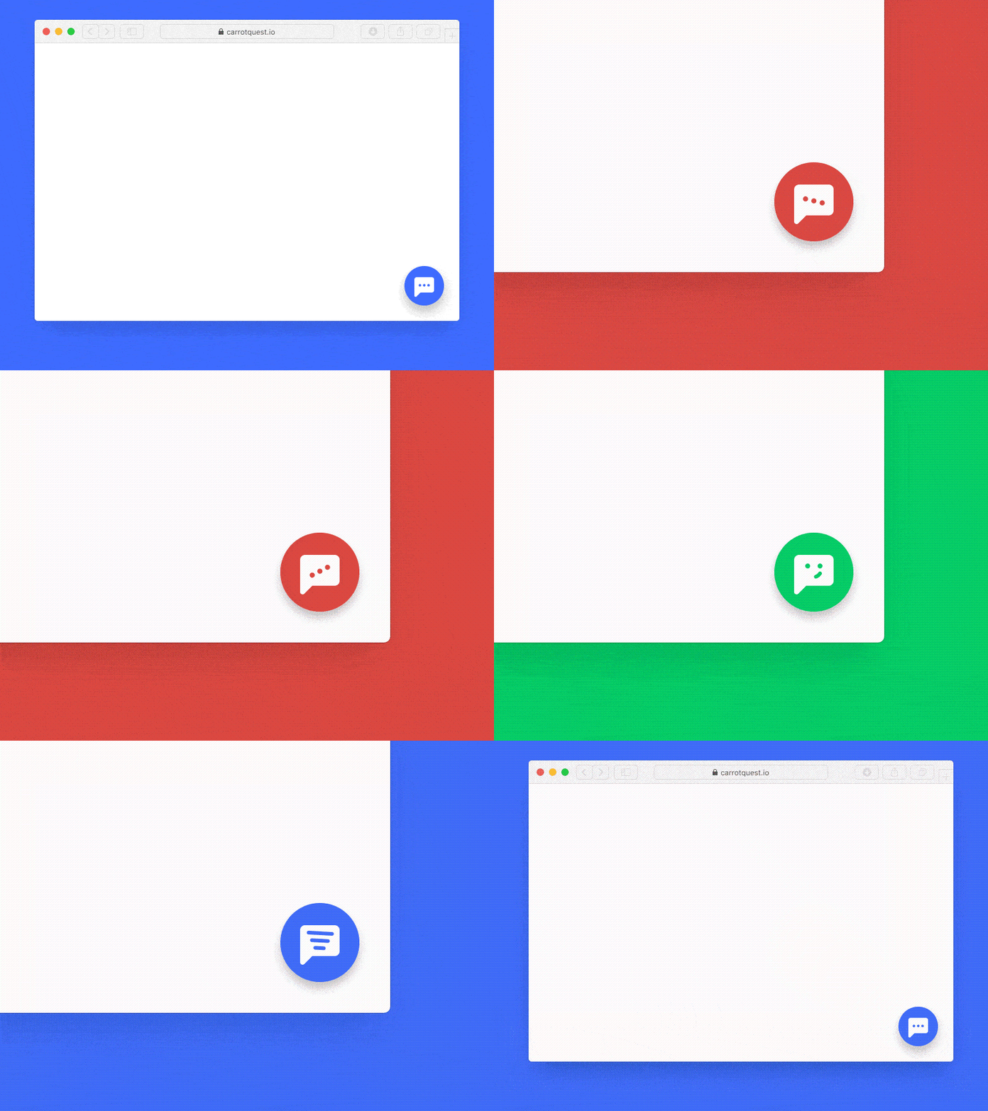
Be it a human-operated service or an AI-based bot, no landing pages is complete without a live chat feature. However, with recent leaps in technology, AI-based live chat software is becoming increasingly effective for providing real-time support and assisting eCommerce buyers to get around the store.
According to the 2018 salesforce study, 69% of consumers preferred AI-based chatbots applications for their daily interactions with online stores. AI chatbots today are capable of answering simple and complex queries, and even improve their answers through machine learning.
According to G2 Facebook Chatbots Guide 2018, live chat software secured a 73% satisfaction rate as a way for customers to interact with online businesses. From their rising popularity, another survey was conducted in 2018 by the State of Chatbots. In the report, 55% of respondents say they would most enjoy getting an instant response and answers to simple questions from a chatbot.
Final Takeaway
As you have already read the tips we have shared in this article, it is time that you try them out for your landing page and start generating measurable results. When you try these tactics, make sure that the optimization goals are centered around conversion metrics, not just creating a comprehensive copy or a visually appealing page. While functionality, cosmetics, and usability go side by side, the key metric that defines your achievement in optimizing your landing page is simply the willingness of your customer to proceed towards your conversion goal. Good luck!

