
Quick Links
Quick Links
Starting your own business is almost never an easy task. Part of that daunting task is creating brand awareness for your product or service.
Well, one way to do that is by creating a website that people will want to click around. However, this is easier said than done, considering that the web design services market is worth over $40 billion as of 2021.
Well, before you can turn a website into a prototype and launch it to the public. You have to come up with how your website layout is going to look. This is where a website mockup comes in.
What is a website mockup? How will that help you get a step closer to launching your website to the public? This is your guide.
What Is a Website Mockup?
Before we can get into the guide for creating a website mockup, we need to make sure that you understand what a website mockup is.
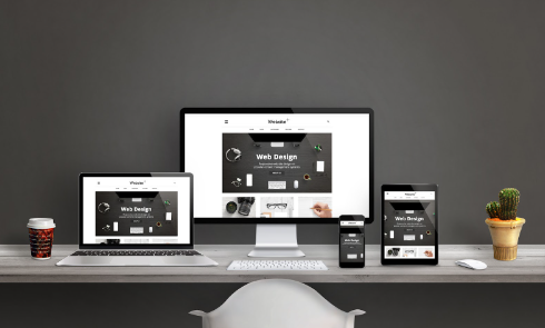
A website mockup is a design of a webpage that allows you to get an idea of what the final product would look like in its current conditions. However, this product is not yet released to the public, and only you are viewing it.
It allows you to assess the look and feel of the potential website from the safety of your own computer. Doing this here first can help you figure out the looks, design, colors, and font that you will want to use on your public website.
Creating Wireframe
The first step to a website mockup is creating a wireframe for it. It is possible to skip this step and go to the next one, but it is recommended that you start with this.
Why? Because this is the place that will allow you to develop the general layout of your website plus the structure of how your web pages are going to be organized there.
At this step, you can also decide if you are going to have a mobile website. If you do, you can work on the wireframe for this as well and save yourself time later in the process.
Either way, these should be relatively similar. You can get a software program that can get you started with this, but it is not required. You can use print-outs or paper sketches as well.
Remember, make sure that you are building a wireframe that will end up being user-friendly. That will keep people on your website for longer time periods, and it will help make it easier for your users to navigate through certain parts of your website.
Adding Visuals
The next thing that you have to do once you have your wireframe set up is to add the visuals that are going to be on your website. Here, if you are using paper sketches or print-outs, you are going to need a software program and/or a digital mockup tool.
One of the biggest things that you need to address at this stage is the color of your website. You won’t have a good idea of what colors look like on websites until you start using mockup tools to test them out.
Do not be afraid to do some research on what colors might benefit your website. For example, blue tends to be the most popular color for people. About 57% of men and 35% of women prefer the color blue compared to other colors.
It is not only about looks. Color affects 85% of a shopper’s purchase decisions, and colors increase brand awareness by 80%. Take the time to do more research on this subject and get feedback before making a final decision here.
Another thing that you will have to decide at this stage is what type of font to use on your website. Now that you have an idea of what the final visual is going to look like do not be afraid to play around with different fonts and see what looks good.
Also, use this stage to check to make sure things you decided on during the wireframe work here. This includes the page layout and the navigation style. It is recommended to use actual content that you want to put on your website to get an idea of how that will be presented on your final website.
Get Feedback
Finally, before any business releases a product, they get feedback to take notes and see what they can improve on. It also gives businesses a chance to see what people’s first impressions of a product are.
Well, it is no different for a website. Send your mockup out to a few close people that you trust and see what their first impression of your potential website is. Do not be afraid to ask for constructive criticism at this stage.
Also, do not be afraid of getting a feedback group to give you their reactions. This may actually be better because you can pick out strangers that meet your target market, and they are much less likely to be biased about your website and/or product.
Create Your Website Mockup
These are three of the biggest keys to creating your website mockup. If you come up with a good wireframe and remember to research your colors and font, you should be good to go.
But what if you are someone that knows nothing about web design? What if you would like to delegate this task off to a professional?
Hire a website designer today to start creating your website.
