
Quick Links
Quick Links
The provision of unique experiences lies at the core of an ecommerce strategy capable not only of driving conversions but also of securing loyalty. And though it was once the exclusive domain of luxury retailers and massive corporations, the explosive expansion of digital data has made it an option for even the smallest of businesses.
Cart personalization can now be heavily automated. Configure your system to draw in data from various sources and alter the user experience accordingly, and you can achieve a significant uptick in performance without investing much time. Combine this procedural activity with some manual effort (where appropriate) and the results can improve even further.
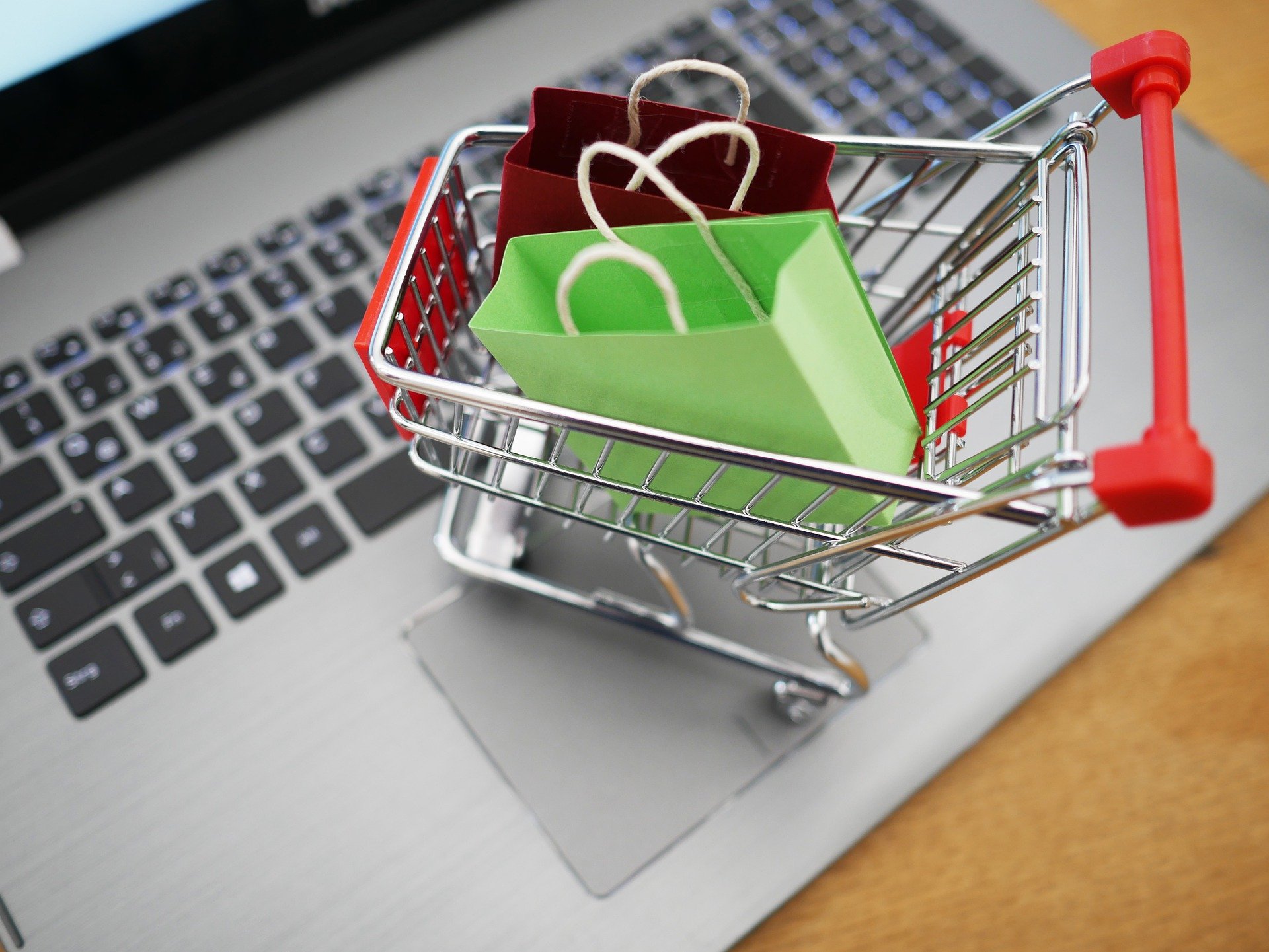
Almost every aspect of the shopping process can be personalized, but here we’re going to focus on the shopping cart: something that stays with the buyer throughout the purchasing process. Selling more isn’t always the answer, but it’s pretty handy — and while cart personalization isn’t done very commonly, it can get some impressive results.
Let’s take a look at 5 notable strategies for cart personalization in 2020:
Provide contextual offers

Featuring offers such as discounts, additional quantities at little or no extra cost, and related items is a classic part of retail cart personalization. There’s some value in having occasional offers just to tempt new customers, but there’s more value in offering them consistently to long-time customers. This is where loyalty programs enter the picture: if you establish reward tiers with notable perks, you can tempt customers to stay loyal and make greater buying commitments to boot.
Most of the time, these perks are communicated in customer emails or social media posts, but they can also be listed in shopping carts. Straightforward discounts can be automatically applied with personalized messages to stress their significance — reading a note along the lines of “20% discount applied! As one of our best customers, you save even more money!” can not only push someone to complete their order but also make them feel more enthusiastic about the brand.
Other discounts can be offered as options, providing interesting ways to customize orders. For instance, adding a product of a particular kind could activate a unique discount, or the shopper could be given two contrasting offers: one to save more money, or another to expedite the shipping. Shoppers like to be given options (not too many, but some) — and 80% of shoppers feel more eager to buy from unfamiliar brands when presented with discounts.
Show dynamic recommendations

Brought to prominence by Amazon when it ascended to international dominance, the concept of showing a select group of products based on the viewer’s recorded digital history (and sometimes their stated preferences) has become an online retail staple. Someone who has purchased various pieces of sporting equipment from a particular site, for instance, can be shown similar items when they revisit the homepage.
The same notion can be extended to a shopping cart, providing useful functionality and tempting the shopper with cross-sells and upsells. Upon visiting their cart, they can find an interesting range of complementary items — accessories, peripherals, etc. — and/or better versions of what they already have in their cart. If each shopper adds one small item to their order, it will amount to a significant jump in revenue. What’s more, implementing cart personalization through product recommendations has proven to improve cart abandonment by up to 4.35%.
Apple, as you might expect, does this tremendously well, offering cases and storage upgrade options aplenty to tempt shoppers to step things up. It sometimes offers a free engraving option to add item personalization, allowing the buyer to make it uniquely theirs. If you’ve added an engraving, you’re going to feel more compelled to complete your order, because it already feels like your product.
Save orders and/or settings

Having access to the data from a logged-in account allows a lot of time to be saved in the purchasing process. This can be quite significant for repeat customers who don’t have a lot of time to get things done. Most commonly, this will be useful for B2B buyers with frequent bulk orders (more on B2B-centric design later), but it can also be handy for B2C buyers who don’t place regular orders but do often need to buy the same things, like consumables.
The most useful data to save are specific orders and settings (potentially consisting of location details, preferred shipping, and payment information). When finalizing their cart, the shopper could be given the choice to save specific elements to be reapplied later — on subsequent visits, they could go directly to their carts, choose their presets, and check out immediately.
You can also tie into this specific cart personalization by allowing customers to receive notifications about the stock status of their preferred items: systems like Repeat Purchase from SaleCycle can automate this process and make it easier for customers to keep stocked-up on items they often need.
List relevant product information

How much data can be stored for a given product? There’s general marketing information in the form of product descriptions, of course, but then there are more significant elements such as dimensions, materials, connections, endurances, or functional types. This may not be significant for B2C purchases, but it can mean a lot for B2B selections.
Think about a real estate developer who consistently buys furniture for new office builds. They might need to work to very tight spatial demands, requiring them to double-check their figures (or even triple-check them) before buying — so it would be very useful for them to get at-a-glance confirmation of product dimensions in their cart.
In another scenario, someone who often needs to transport goods in a vehicle with specific load tolerances might want to see weight displayed most prominently. All information will be accessible when needed, of course, but this is about giving each customer the option of getting a personalized view of what they value most to make their buying process easier.
Create unique aesthetics

The cart personalization strategies we’ve looked at so far have been about functionality, but there’s also a lot of value in personalizing aesthetics. How is the cart colored? What does the layout involve? Which elements can be included, and which can be left out? Many B2B businesses have limited numbers of high-value customers and ultimately choose to create a tailored buying portal for each one, so this is an extension of that approach.
Noticing that every part of their experience has been personalized might not radically change how a given customer views your brand. It will, however, strengthen your perceived professionalism and show your commitment to leaving no stone unturned. It’s so often the minor details that make all the difference in setting you apart from your competitors, particularly where ever-important customer service is concerned.
This isn’t done often, with the only widespread use concerning personalized banner selections (something that achieved a 7x uplift in conversion in this case), but there’s no reason why you couldn’t get into the habit of setting some aesthetic options for high-value customers (even if you’re not offering fully-custom portals and go with user logins instead to store these settings).
Wrapping Up
These cart personalization strategies give you options for designing shopping carts that can increase order values, save shoppers’ time, minimize cart abandonment, and ensure that the customers you value the most continue to view your brand in a positive light.
The shopping cart isn’t the most important element of your store, but it’s one that certainly shouldn’t be overlooked.

